Categories
Dev

Multi-core array operations in Swift

I finally had a reason to use DispatchQueue.concurrentPerform to spread some chunks of work across multiple cores. There’s something very satisfying about filling up CPU cores with work!

So with a bit of help from StackOverflow I came up with this Array extension for using map and for-each with a simple API.

The functions themselves are synchronous, but DispatchQueue.concurrentPerform does its magic and runs the passed in closures across the cores.

Here’s the code. Got a suggestion? Let me know on the Gist.


Array+Concurrency.swift

public extension Array {
    /// Synchronous
    func concurrentMap(transform: @escaping (Element) -> T) -> [T] {
        let result = UnsafeMutablePointer.allocate(capacity: count)

        DispatchQueue.concurrentPerform(iterations: count) { i in
            result.advanced(by: i).initialize(to: transform(self[i]))
        }
        
        let finalResult = Array(UnsafeBufferPointer(start: result, count: count))
        result.deallocate()
        
        return finalResult
    }
    
    /// Synchronous
    func concurrentForEach(action: @escaping (Element) -> Void) {
        _ = concurrentMap { _ = action($0) }
    }
} 

Usage

// Works just like regular `map` and `forEach`.

let things = [1, 2, 3, 4]

// 1
// 2
// 3
// 4
things.concurrentForEach {
    print($0)
}

let multipliedByTwo = things.concurrentMap { $0 * 2 } // [2, 4, 6, 8]

Categories
Dev

Tip: Make XCTestCase tests throw

Here’s a quick tip so you don’t need to try! or do { ... } catch { ... } so much in unit tests:

Mark your test functions with throws.

import XCTest

class ModelTests: XCTestCase {

    func testSave() throws {
        let model = Model()
        try model.save()
        XCTAssert(...)
    }

}

No ugly exclamation marks, and if an error is thrown the test still fails and the error is logged to the test console.

Categories
Dev

Autochords for Mac v1.0

A couple of days ago I quietly released Autochords for Mac (App Store link).

Despite the frustrations experienced by many Mac developers, I decided to release on the Mac App Store. I think it’s still the best way for people to find and buy new apps, plus I don’t have any payment infrastructure set up for myself and the App Store makes this very easy.

Funtionality-wise the Mac version pretty similar to the iOS version. It has a few additional moods, and the ability to play back an entire progression. It requires El Capitan[1] and supports full-screen and side-by-side modes.

While Autochords on iOS is ad-supported (with in-app-purchase to remove ads), I decided to try selling the Mac version for actual money. I think it’s quite low-priced for a Mac app at US$4.99, but I’m considering increasing the price as I add more advanced features.

For the two days since launching, Autochords has been the first app under All Music Apps, and it seems to have picked up a few purchases from there. With the low volume of new apps on the Mac App Store, maybe it will stick around near the top of that list for a while.


  1. I don’t think I’m using any APIs that would prevent targeting an older OS, so I might fire up a VM and do some compatibility testing.  ↩
Categories
Dev

Communicating via Release Notes

I’ve been on a more rapid release schedule with Autochords for iOS lately, which means writing more release notes…

I don’t nag for reviews in the app or even have a feedback/review link anywhere[1], so I thought I’d try asking for reviews in the release notes. I added the phrase, “If Autochords has helped you write a song or you had a good jam with it, why not leave a nice little review? :)” to the release notes to see if I could get some new reviews. It worked quite well, with about 6 people writing reviews and all of them positive. Previously I’d mostly only get reviews if people ran in to bugs, so that’s certainly been an improvement.

In a later update I also said: “Email hey@autochords.com if you have any suggestions for new progressions!”. This has only given me 1 email so far, but it was actually a really good suggestion so I’m counting that as another win. 😁


  1. Ironically, I got an email requesting this recently so I probably will add some feedback and App Store review links to the app soon. I still won’t be a dick about it though.  ↩
Categories
Dev

Viewing Crash Logs in Xcode

I recently released an update to Autochords which removed a bunch of dependencies and frameworks, including Crashlytics.

Crashlytics is really great, but it’s just one of those things that I’d rather not have to rely on. Turns out Xcode includes a pretty neat way to view crash logs for your beta and released apps. If you haven’t looked at Apple’s crash reporting in a while, it’s definitely worth another look.

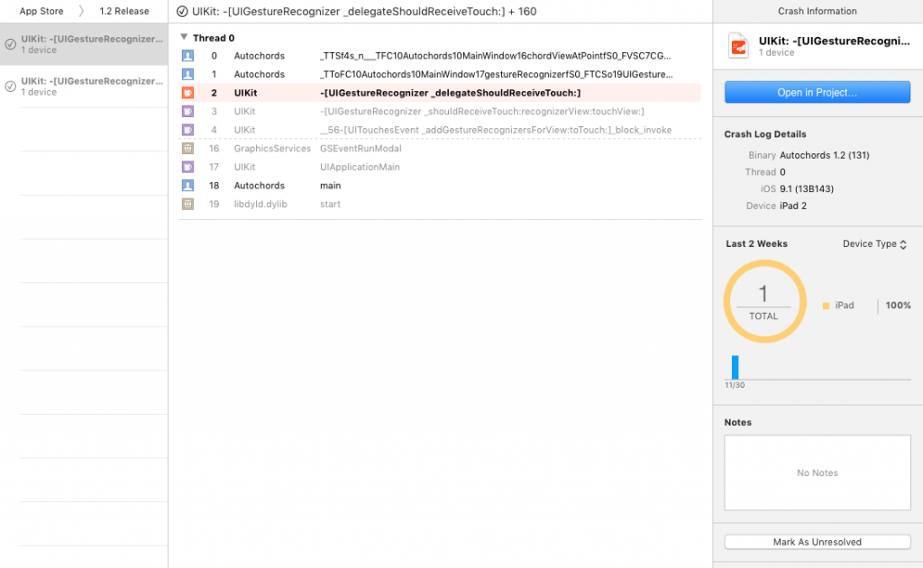
To check it out, from Xcode go to Window → Organizer, then the Crashes tab. Your apps will be listed on the left, and you’ll be able to select a particular build to view its crashes. I’m fairly certain this only works well when you’ve elected to include a dSYM as part of the app upload process.

Screenshot of Xcode showing a crash in UIGestureRecognizer _delegateshouldReceiveTouch:.

So it hasn’t got the delightful animations of Crashlytics, and marking an issue as resolved doesn’t give you that satisfying rubber stamp effect, but it’s really working well for me.

A good/bad thing is that it’s controlled by a user’s system-wide preference for sending diagnostic information to developers. I don’t know what the opt-in rate is, but it does make me feel good to not have to bug my users with an “Oops we crashed” message and I know that I’m respecting my users’ privacy preferences.

Categories
Dev

UICollectionViewCell Auto Layout Performance

I’ve been converting the main posts view in Pinpoint from a table view to a collection view. Unfortunately, I found that it was stuttering even on my brand-new, ridiculously fast iPhone 6s Plus.

The cells have background images, buttons, and gradients, so I thought I’d need to optimize those. But when I spun up Instruments and had a look at the CPU usage I found that a lot of main thread CPU time was spent on layout.

Problem

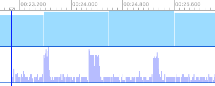
When slowly scrolling through the collection view, I could see spikes like this when each row displayed. Something was taking too much time to prepare those collection view cells. Probably my collectionView:cellForItemAtIndexPath:, right?

Screenshot of instruments showing CPU spikes

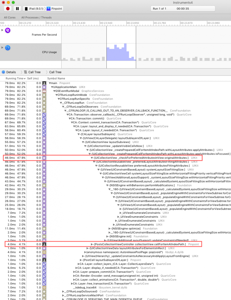
Focusing in on one of those spikes, I could see that the cell re-use looked okay at only 4.1% of the CPU time. But what about that deep stack of Auto Layout calls? Something called -[UICollectionView _checkForPreferredAttributesInView:originalAttributes:] was taking up a lot of CPU time.

Instruments call tree

Solution

After a bit of searching, I stumbed across a blog post by Marcin Pędzimąż about UICollectionViewCell performance.

Marcin’s suggestion/solution was to use the following in your UICollectionViewCell subclass. Unfortunately he doesn’t say why.

- (UICollectionViewLayoutAttributes *)preferredLayoutAttributesFittingAttributes:(UICollectionViewLayoutAttributes *)layoutAttributes {
    return layoutAttributes;
 }

This completely solved my problem. Scrolling is now super smooth even on a 4S.

I still haven’t found any documentation on why the default implementation is so expensive, but someone else also found that this solved their problem.

I doubt this is a silver bullet for collection view performance, but worth a shot if you get stuck.

Categories
Dev

Functionality discoverability

When I’m planning out the user experience of an app, I make sure that the most basic features are immediately obvious. Often there will be more advanced features that I want to include without detracting from the core experience. These are the kinds of things you might hide in a contextual menu or keyboard shortcut on a desktop/web app.

Advanced functionality in a touch interface might be behind a long-press, swipe, double-tap, zoom-flip-rotate-double-finger-triple-tap… whatever it is, users need to realise that the functionality actually exists in the first place before they think to look for it.

Subtle indications about how people should expect an interaction to work are difficult to get right. I think Apple’s best example of this is the camera on the lock screen. Tap it and the lock screen bounces as an indication that you can slide it up to reveal the camera app. Unfortunately even with this example I’ve seen people who don’t take that bounce hint to mean ‘you can slide me up’.

There are plenty of other elements that people have learned though, like scroll bars and horizontal page indicators.

If our subtle indications aren’t obvious enough, in-app help sounds like a cop-out, but I think it’s actually the best solution for exposing advanced functionality to users. I hope that people will seek it out once they understand the basics of my app. Of course, I could be wrong and totally overestimating people’s willingness to seek help before leaving a 1-star review.

To give a concrete example, with Autochords I weighed up the importance of the main functionality that this (admittedly simple) app provides.

  1. View chord progressions.
  2. Select a progression style and musical key.
  3. View alternative progressions.
  4. See how to play a chord.
  5. Hear how a chord sounds.
  6. Play back an entire chord progression.

And that’s not even everything. I tucked some more advanced, less critical options away in in-app settings, like the dark mode option. It’s tricky to know what is most important to most of your users – the ranking I went with is definitely not the same for everyone.

Here’s the interaction required for each.

  1. View progressions.
    • Simply launch the app.
  2. Select a progression style and musical key.
    • Tap the buttons in the bottom-left and bottom-right corners.
    • OR just tap the shuffle button in the top-left.
  3. View alternative progressions.
    • Swipe on the progression in the middle of the screen.
    • I’d consider this somewhat advanced because it requires people to realise that the 3 dots page indicator means they can swipe. Sure, they’re probably familiar with it from their home screen, but you never know.
  4. See how to play a chord.
    • Tap on a chord.
  5. Hear how a chord sounds.
    • Tap on the chord diagram after tapping on a chord.
    • OR long press on a chord.
  6. Play back an entire chord progression.
    • Long press on a chord and move your finger across to other chords.
    • This is definitely the most unintuitive of the features listed here.

The issue that sparked this post is #6. It’s not intuitive enough. I’m thinking that some in-app help is going to be the best solution. I’m also really excited about app preview videos in iOS 8. With a few captions and hints about what functionality is possible, I hope that people will be able to discover these somewhat hidden features in apps.

Categories
Dev

Toggling Full-Screen Split View Controllers in iOS 8

I had some trouble understanding exactly how to get a split view controller to have a toggling master view controller. The problem was that I assumed I needed to manage my own UIBarButtonItem that calls a method on the split view controller.

There are a few pieces I had to put together to get the functionality I wanted.

First, I had to set my split view controller’s preferredDisplayMode to UISplitViewControllerDisplayModeAllVisible. This displays the master on the left, detail on the right.

Next I needed a button toggle the master view controller.

After re-watching WWDC session 204 (text version here), I realised that the UISplitViewController actually provides you with the button through its displayModeButtonItem.

So basically if you put the button in a toolbar or navigation bar, its state, target, and action are going to be managed for you.

I set the toolbar button when the detail view controller gets set. In my storyboard-based app it looks like this:

- (void)prepareForSegue:(UIStoryboardSegue *)segue sender:(id)sender {
    if ([[segue identifier] isEqualToString:@"showDetail"]) {
        DetailViewController *controller = (DetailViewController *)[[segue destinationViewController] topViewController];

        // Set a few properties for the detail view here...
        // ...

        // And set the button item.
        controller.navigationItem.leftBarButtonItem = self.splitViewController.displayModeButtonItem;
    }
}

The last piece of the puzzle was getting the toggle action set up properly. Since the appearance of the button that the split view controller provides depends on what will happen when you press it, you need to specify what will happen. You do this in the UISplitViewControllerDelegate’s targetDisplayModeForActionInSplitViewController:. For me, that looks like this:

- (UISplitViewControllerDisplayMode)targetDisplayModeForActionInSplitViewController:(UISplitViewController *)svc {
    if (svc.displayMode == UISplitViewControllerDisplayModePrimaryOverlay || svc.displayMode == UISplitViewControllerDisplayModePrimaryHidden) {
        return UISplitViewControllerDisplayModeAllVisible;
    }
        return UISplitViewControllerDisplayModePrimaryHidden;
}

With very little code and no third-party dependencies, I’ve got a universal split view controller that behaves as you’d expect on all iOS devices, with an option to hide the master controller.

Categories
Dev

UISplitViewController Question

Brent Simmons asks about dealing with three-level hierarcy in an adaptive split view controller (presumably for Vesper this means Tags and Note list on the left, Note details on the right).

His answer so far is here: https://gist.github.com/anonymous/797aa235dffcf9ed15e3.

And this tip is excellent:

And — bonus — @FriedLemur has the tip of the day (regarding DerivedData):

Option key turns Clean into Clean Build Folder, pretty much rm -rf

That’s so much better than me trying to remember where the DerivedData folder actually is.

Categories
Dev

Screenshots for new devices

A universal iOS 8 app will run on the following devices.

  1. iPhone 4s (3.5-inch)
  2. iPhone 5 (4-inch)
  3. iPhone 6 (4.7-inch)
  4. iPhone 6 plus (5.5-inch)
  5. iPad

For a non-trivial app with 5 screenshots plus preview videos, we’re all going to be very busy…